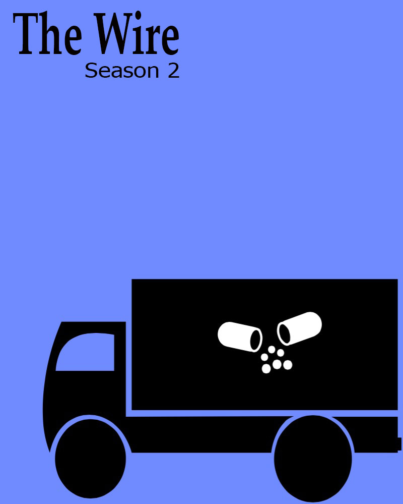
This assignment was interesting! I decided to use Photoshop for this one. I found this one kind of difficult as I was trying to figure out what I was doing while in Photoshop itself. But I definitely got the hang of it though! I really like the thought of this assignment, trying to capture the essence of the show with just a few things on the poster itself. So I started out with a new project in photoshop, where I made the poster an 8×11. Then I made the background this blueish purple color. I was trying out different colors because I wanted to get a color that conveyed what was going on in this season. Because this season is focused on the port, and international trade, I pick the blue. I put in the text after that, using the text box tool. After I found the right placement I googled truck clipart, to find the truck that was put in this poster. I had to cut out the background to just have the truck without the white background. Then I found the image of the broken pill. I put this on the truck because I thought this would say another thing about the season because of the smuggling that goes on in this season. I feel like the placement of the text combined with the placement of the truck helps balance out the poster as well. I really enjoyed trying to find good a good design for the poster, and experimenting with the different placements.
Meredith,
You did a fine job emphasizing the design as well as color elements of this weeks episodes. Blue was definitely the theme for these past three episodes we watched.
From the discovery of Frank Sobotka’s drug operation of his “blue” paint pellets to the blue top drug reference of the on going Avon Barksdale’s drug operation, blue was a reoccurring theme and color for many things.
Nice contextualization of Frank’s operation per your images which you used in Photoshop. The broken pill is a simple reference to the continents of what we all know is in the truck. But otherwise good job!
I love this poster! It is very simple, but captures what season 2 is all about! The colors and the image balance it out well, which makes this effective.